
Programinės įrangos kūrimas
KRAUNAMA
Kam kuriame
Įkūrėjai ir komandos, kuriančios skaitmeninius produktus.
Bendradarbiavimo modelis
Produktizuoti sprintai ir tęstinės partnerystės.
Pradžia: per 2–4 savaites
Tik „senior“ lygio pristatymas
Rinkitės kryptį
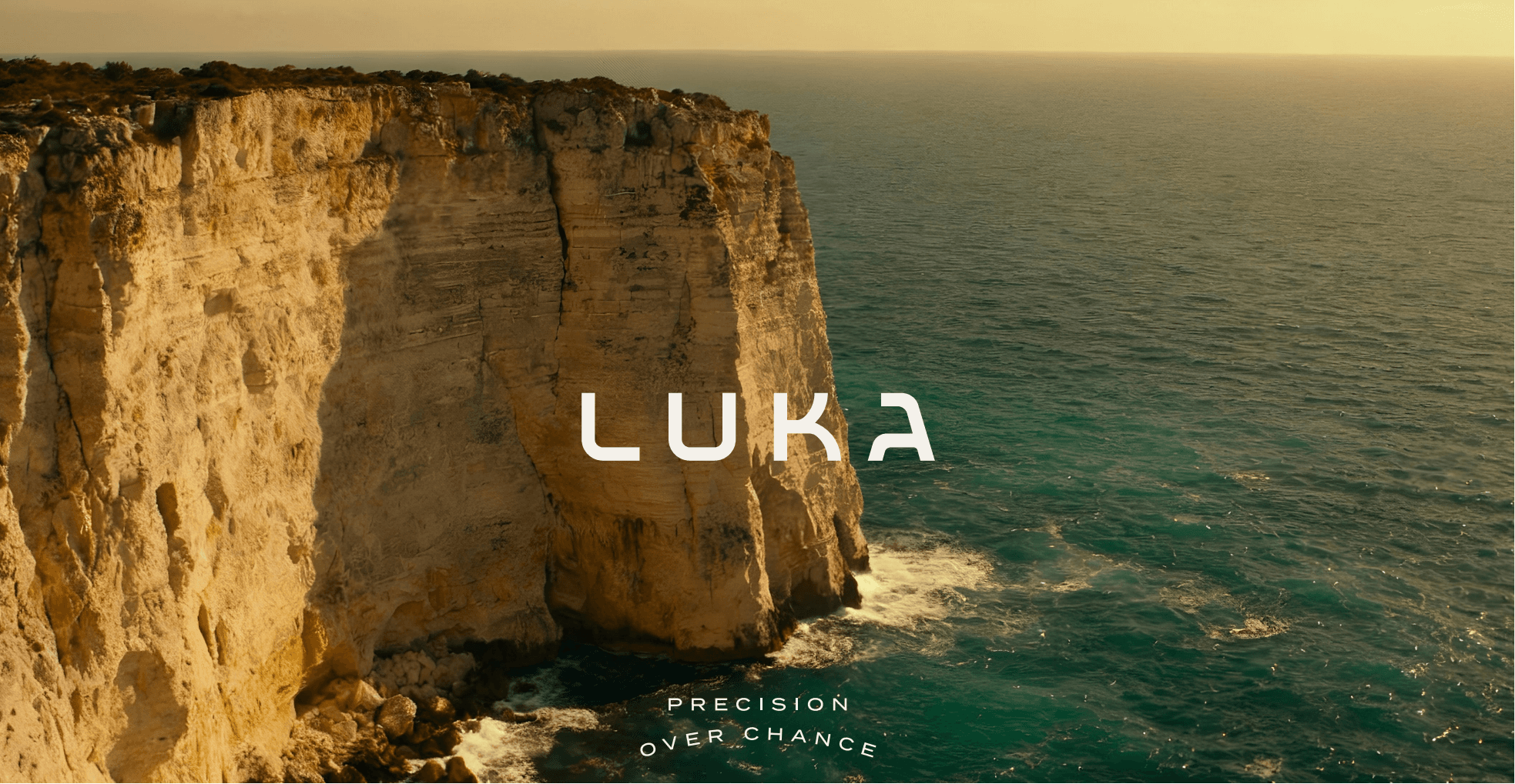
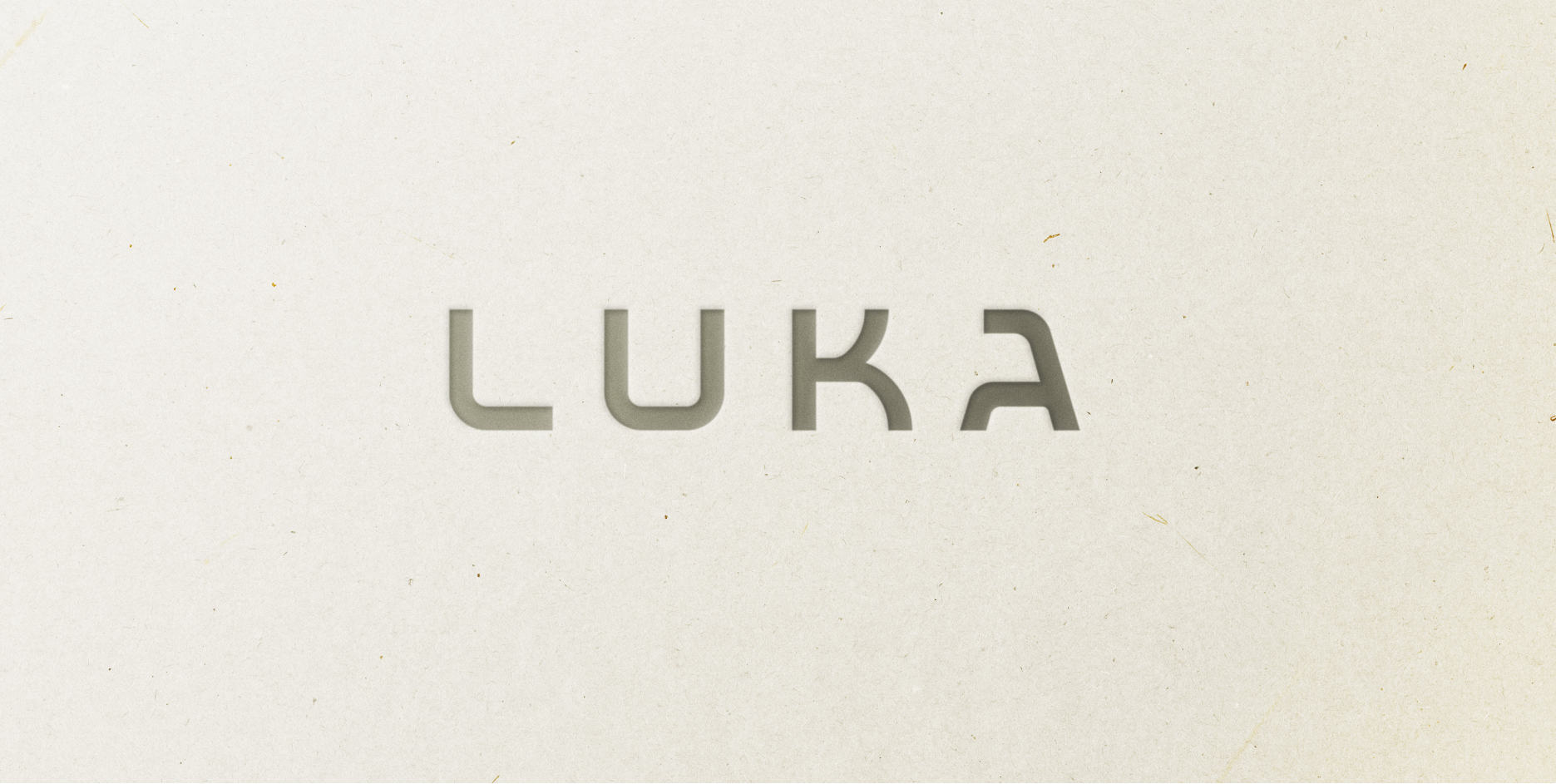
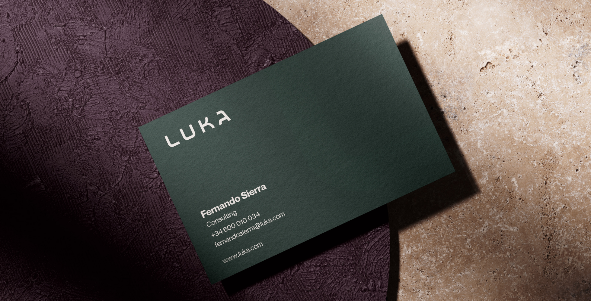
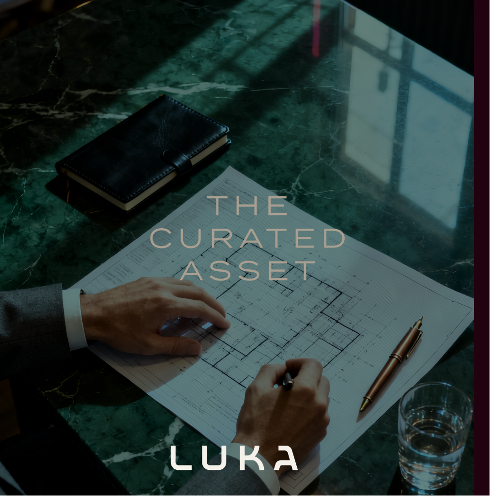
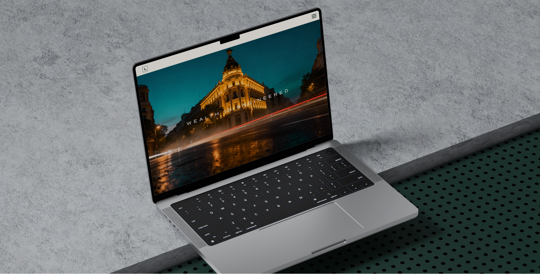
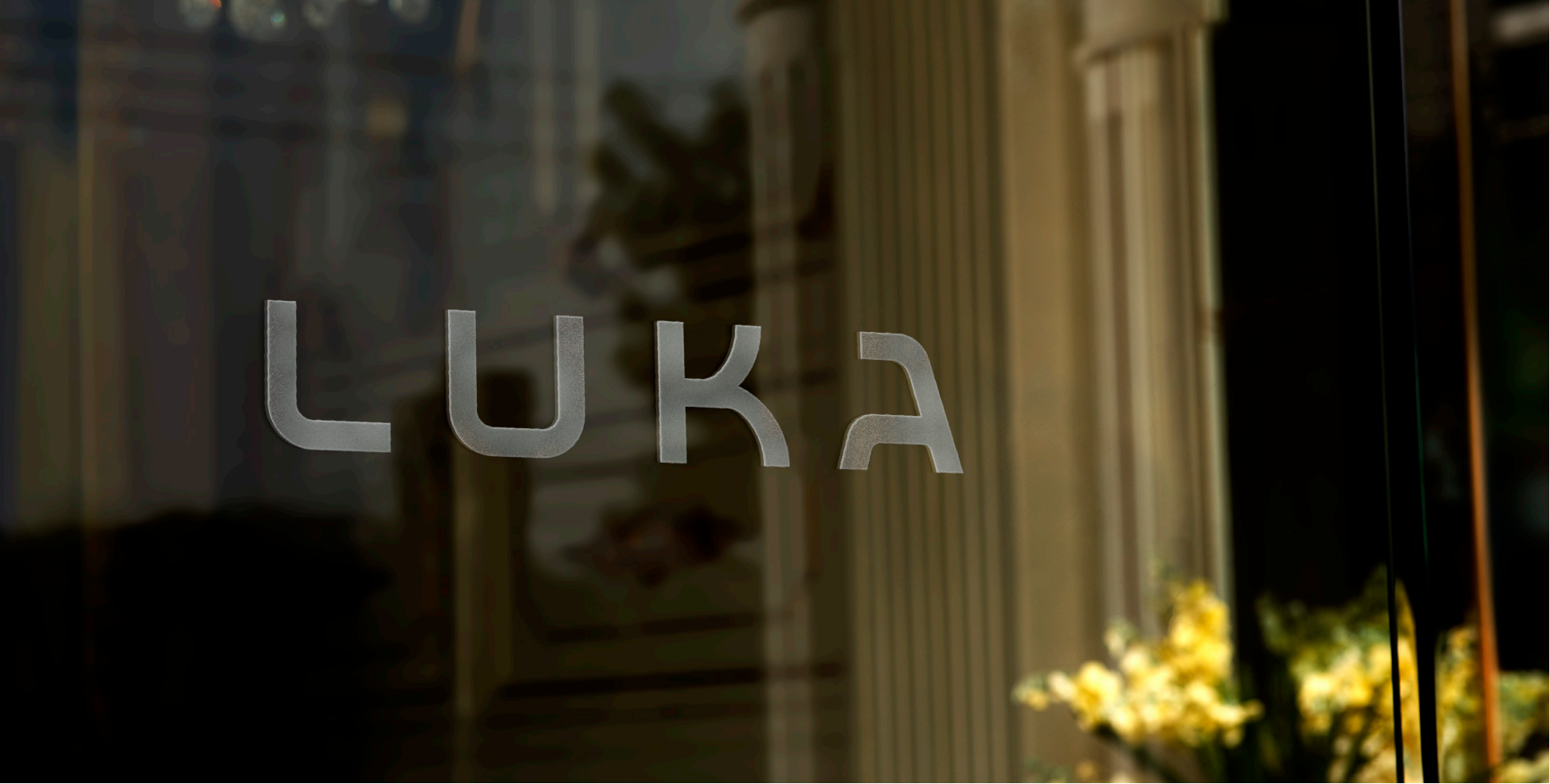
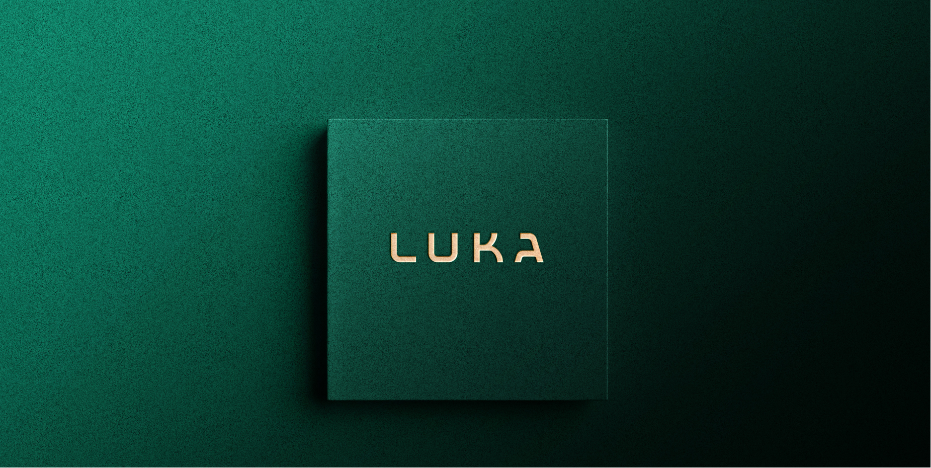
Luka Capital came to us with a clear conviction — they were not brokers, they were wealth architects. The challenge was to build a brand identity as rigorous and uncompromising as their investment methodology. We stripped everything non-essential: no icons, no decorative symbols, no visual shortcuts. What remained was pure structure. The centrepiece of the system is a proprietary wordmark — not a commercial typeface, but a bespoke construction built from mathematical precision. The 'A' was deliberately designed as an architectural apex, symbolising the projection and protection of capital. Every angle earns its place. The brand speaks in the same register as the firm: surgical, absolute, authoritative.

Design: Luka Capital
Development: Authect
Animation: Authect
Backend: Authect
Ongoing Support: Luka Capital
Want results like this?
76%
Faster Load Time
x3
Page Interactions
100%
Proprietary wordmark